From Darkness to Light: Debugging with Leading and Lagging Metrics

Most engineers debug by instinct — check the service you own, open the dashboard you built, look where the alert fired. This doesn't work in most complex systems. The problem isn't tooling. It's direction: alerts fire on outcomes, and outcomes are the wrong starting point for root cause analysis.
This post is about building a systematic path from symptom to cause, using the structural relationship between leading and lagging metrics as the spine of your reasoning.
The distinction
A lagging metric measures outcome. P99 latency, error rate, Apdex score — these are correct things to alert on and wrong things to debug from. By the time they degrade, the cause has already been operating for seconds to minutes.
A leading metric measures a condition that precedes an outcome. Connection pool wait time, GC allocation rate, consumer lag growth rate, upstream dependency P99 — these are where the cause lives. They are almost never in your SLOs and rarely trigger alerts.
The causal structure is always the same:
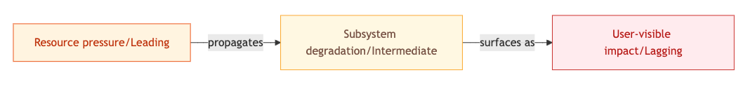
The alert fires at C. The cause lives at A. The time gap between them — seconds to minutes depending on your system — is where most debugging time gets wasted, because engineers anchor on C and work backwards without a method.
The systematic mechanism
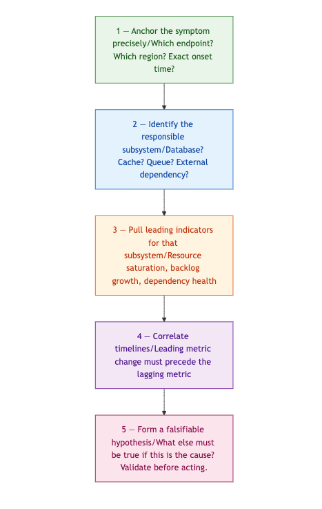
Step 1 is about precision, not observation. "P99 on /checkout went from 180ms to 1,400ms at 14:32 UTC in eu-west-1 only" eliminates network-wide and deployment-wide hypotheses before you've checked a single metric. Vague symptom definitions force you to keep all hypotheses alive simultaneously.
Step 2 requires a dependency graph. Not an architecture diagram — a current, accurate map of what your degraded endpoint actually calls. Without it, this step is a guess.
Step 3 is where most teams have gaps. Each subsystem has a known, finite set of leading indicators. Build this map before incidents happen.
Step 4 is the filter. A leading metric that changed after the lagging metric is a co-effect, not a cause. A leading metric that changed simultaneously might be. One that changed before is your candidate.
Step 5 is the discipline that prevents acting on a wrong hypothesis. If your hypothesis is correct, it makes additional predictions about other metrics. Check those predictions. A fix based on a wrong hypothesis either does nothing or makes things worse.
Leading indicators by subsystem
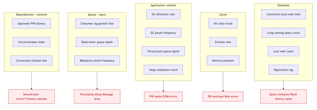
Know this map. The top column is where you look. The bottom column is what fires the alert.
Scenario 1 — Upstream latency cascading through a connection pool
Symptom: P99 on /api/orders spikes from 120ms to 900ms. No error rate change. Recent deployment was two hours prior. Database metrics are clean.
The instinct is to keep looking at the database. It's the obvious dependency for a read endpoint, it's already open, and it looks suspicious because the query is slow. But the query latency is a consequence of connection pressure, not a cause — and the connection pressure is coming from somewhere else.
Step 2 reveals that /api/orders calls an internal inventory service and an external pricing API. Step 3 points to upstream P99 latency and connection pool wait time per client as the relevant leading indicators. Step 4 finds it: the pricing API P99 climbed from 45ms to 650ms at 14:28 — four minutes before the user-facing alert.
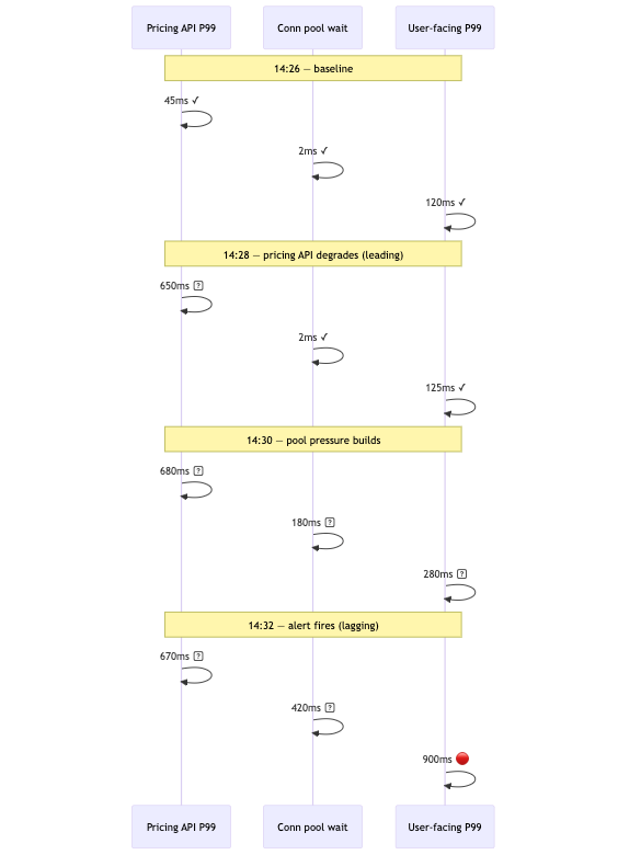
Step 5 hypothesis: slow pricing API responses hold HTTP connections open, exhausting the pool, queuing new requests. Prediction: connection pool wait time for the pricing API client is elevated, and the pricing API error rate or P99 is elevated independently. Both confirm.
Total time to diagnosis: under five minutes, versus the forty spent looking at the wrong layer.
Scenario 2 — Memory leak misattributed to traffic growth
Symptom: Error rate climbs from 0.02% to 1.8% over three hours — OOM errors and connection refusals. Traffic increased 15% at 13:00, which is where attention anchors.
The team scales out. Error rate drops briefly, then resumes climbing. The scaling hypothesis felt right because the correlation was real — traffic did go up. But gradual drift over three hours is not a capacity signature. Capacity problems produce step-function threshold crossings, not slow ramps.
Step 3 on the application runtime: heap utilization trend over six hours, not thirty minutes. The chart shows continuous growth starting at 09:00 — four hours before errors surfaced. GC pause frequency doubled at 11:30. The traffic increase at 13:00 accelerated the allocation rate past the OOM threshold but did not cause the leak.
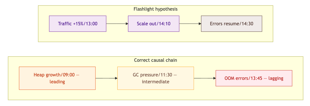
The 09:00 start time, surfaced by the leading metric, is what you correlate against deployments and cron jobs. That's your root cause window — not 13:00.
Scenario 3 — Queue lag with an unmonitored upstream cause
Symptom: Customer reports that order confirmation emails aren't arriving. No alert fires for forty minutes because email delivery has no SLO. When an engineer looks, Kafka consumer lag on order-events is at 2.4M messages and climbing.
This scenario adds a second failure mode: the leading metric had no alert, and the lagging metric had no SLO. Both gaps compounded to produce a 90-minute blind spot.
Step 3 for the consumer: poll rate, processing time per message, consumer group rebalance events, upstream call latency from within the consumer. The rebalance history shows twelve rebalances in 90 minutes. Each causes a 15-second consumption pause. At 40,000 messages per minute processing capacity, that's 10 minutes of lost capacity per hour — a slow, compounding deficit that's invisible without this specific metric.
Step 4: rebalances started at 11:10. Consumer crashes are caused by unhandled exceptions from a user enrichment service returning 504s — also starting at 11:10, fully unmonitored.
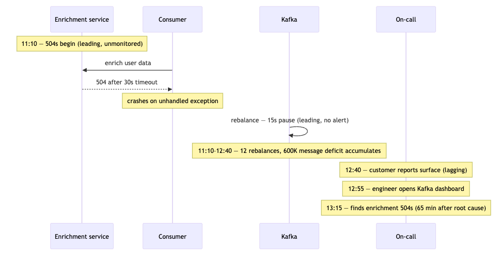
The fix isn't Kafka tuning. It's the enrichment service. The leading metric — enrichment upstream call error rate from within the consumer — was always available. It had no dashboard and no owner.
Building the map before the incident
The framework requires two pre-incident artifacts.
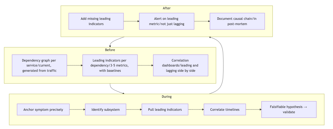
Each incident exposes at least one leading metric that should have been visible. Add it. The post-mortem's job isn't just blame assignment — it's extending the observability surface so the same causal chain is visible earlier next time.
The principle
Lagging metrics tell you that impact has reached users. Leading metrics tell you why, and when the condition started. The time gap between them is where root cause analysis actually lives.
The framework is the same regardless of which system is degrading: anchor the symptom, walk to the responsible subsystem, pull its leading indicators, correlate the timeline, validate a falsifiable hypothesis. Five steps, consistent order, no shortcuts. That consistency is what separates a four-minute diagnosis from a four-hour one.